Helping brands connect through purpose and story, with design that makes showing up easy.


About
Smart, cohesive design that takes the weight off your shoulders. From full brand identities to websites and campaigns, the goal is always to create systems that fit your business naturally and remain effortless to manage.


Approach
Every project starts with understanding your goals while building on what's already working. Your perspective guides the direction, turning rough ideas into clear, functional solutions built to grow with your business.
Meet the Designer
I’m Cat, a brand and visual designer focused on work that feels natural, tells a story, and is effortless to use.
Throughout my career, I’ve worked with businesses of all sizes, from household names to independent brands. Years of handling ambitious launches and complex rebrands taught me how to keep the process simple and focus on what actually works. For me, the goal is always to build adaptable systems so you walk away with work you love and the tools to run your business with ease.

SERVICES
Strategy and design working together. Discover who your business serves and what sets it apart, followed by a complete visual system and guidelines to keep your brand consistent everywhere you show up.

A thoughtful visual tune-up for when your business has outgrown its original look. Tidy up tired logos, sharpen your typography, and modernize your palette, giving your brand new life without starting entirely from scratch.

A clean, responsive website built around how people actually browse. Focused on clear hierarchy, custom layouts, and intuitive navigation, creating a seamless experience that turns casual visitors into loyal customers.
Thoughtful guidance for launching something new or building out an idea. Working alongside your team to offer visual direction, feedback, and support, ensuring every creative detail stays true to your brand throughout.
brite water - Little Brown Jug brewery
Brite Water, developed by Little Brown Jug Brewery, set out to refresh their identity with a focus on sustainability and local sourcing. The rebrand highlights eco-friendly practices at every step, from water sourcing to packaging, positioning Brite Water as a premium, environmentally responsible choice. This fresh look strengthens their identity and reinforces their commitment to environmental values.
Forks Trading Co.
Since 2008, Forks Trading Company has been carefully curating unique products, putting the spotlight on Manitoba’s Maker community. The FTC team wanted to refresh their brand and expand it to include their sub-brands: The Allery and Maker Faire. The Allery is a creative studio space that embraces all kinds of artistic expression, while Maker Faire is a lively market where makers can showcase their craft, share their stories, and connect with those who appreciate handmade goods.
Home One Germany
Home One Germany has built a reputation for designing resorts, cabins, and saunas that emphasize sustainability, accessibility, and minimalism. With plans to expand into single-family homes, the Cabin One team realized it was time for a fresh name and brand update. The rebrand focused on showcasing their new offerings while staying grounded in the values that have always shaped their work.
drinksense - Manitoba Liquor and Lotteries
The DrinkSense rebrand is all about helping people find a balanced approach to alcohol consumption. The program offers practical tips and valuable information to empower individuals to make smarter choices about drinking. Choices that boost energy, create lasting memories, and improve overall well-being. The goal was to take a positive, educational approach, encouraging safe and healthy ways to enjoy alcohol responsibly.
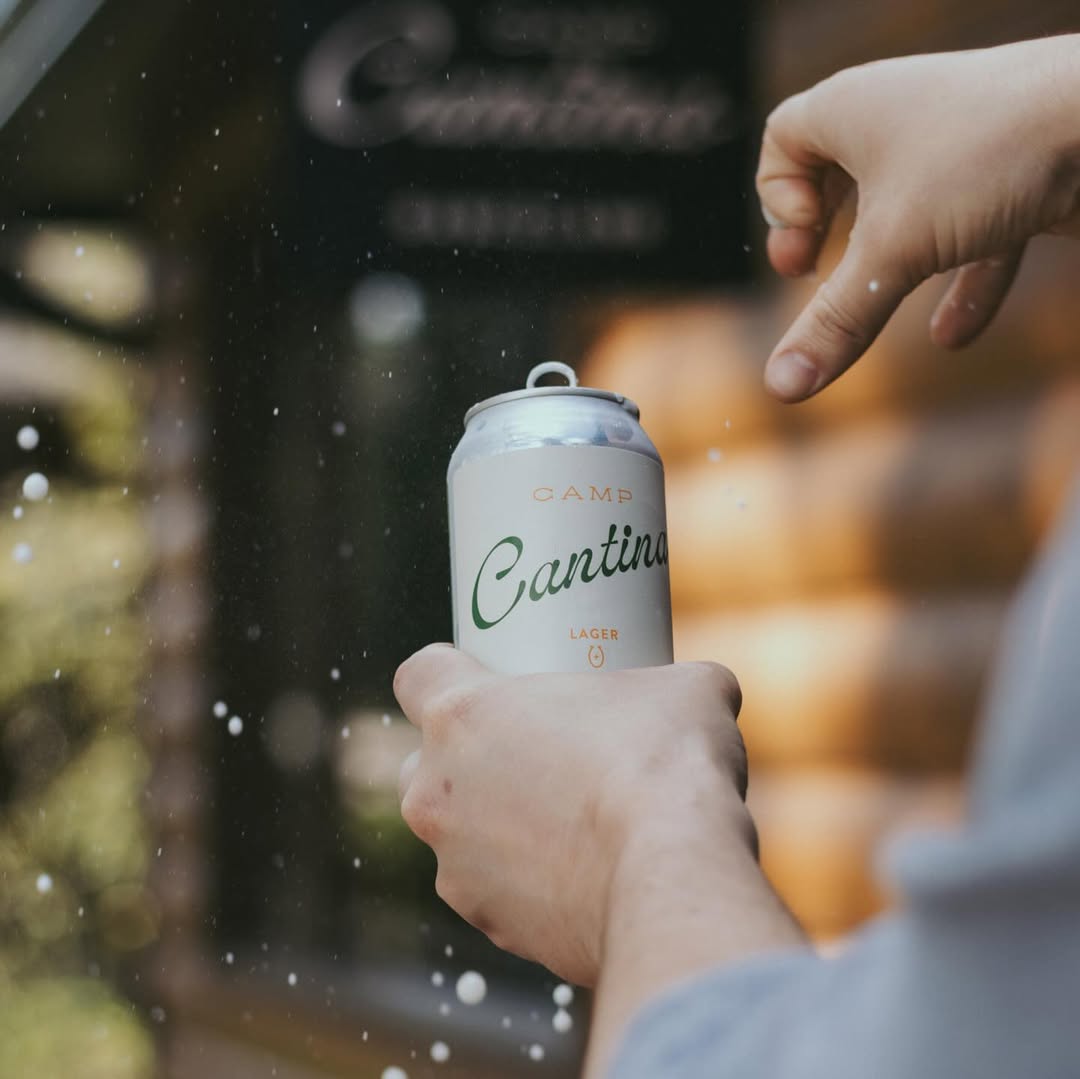
camp cantina - Riding Mountain National Park
Inspired by a love for food and wine, the owner of Camp Cantina wanted to bring something special to Riding Mountain National Park. Nestled in the historic Danceland building, this vibrant spot offers a deli, takeaway counter, and wine bar, all surrounded by the park’s stunning beauty. We created a brand identity that blends the building’s rich history with the natural surroundings, giving the space a unique, welcoming atmosphere.
Leadwise Business foundations
LeadWise is all about helping professionals unlock their potential through coaching and leadership development. We teamed up with them to create a brand identity and website that truly reflect their mission to help businesses build the stability they need to thrive. Every part of the brand was designed to feel empowering yet approachable, offering professionals a space to connect, grow, and feel inspired on their leadership journey.
Process

We explore your industry, your audience, and the landscape you’re working within. We’re looking for patterns, gaps, and opportunities, but also for the deeper themes that could shape how your brand shows up. This is also where we start building a moodboard to visually capture the tone, style, and direction your brand or website could take.
Get in touch
Kind words